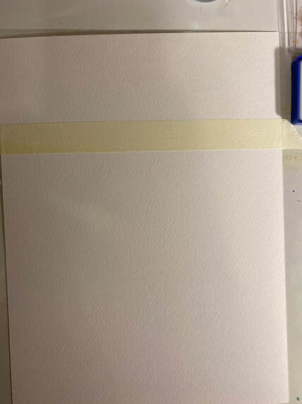
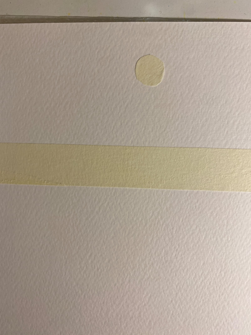
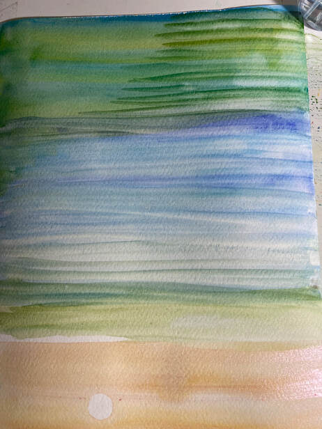
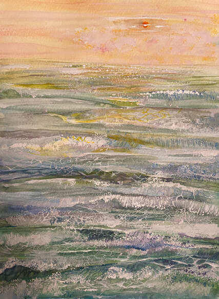
The process of drawing the sea with watercolor Compared to my other paintings at the art show I attended this summer, the sea paintings are all sold out. Here on Long Island, many people love the sea, especially because it is surrounded by the sea and has numerous beaches. I drew a new beach picture today. And I want to share the process in a moment. Just as the shape and atmosphere of the sea change color every moment, the artists' methods of expressing the sea are also different. All based on the artist's personality, philosophy, skill, speed, etc., each reveals his or her individuality. Therefore, each may have a different way of representing the sea. Here, I would like to show you the sea drawn in my own way for a moment. First of all, I think most of the parts below will be similar. Attach it to the horizontal part with masking tape. This allows for a more natural processing of the borders.
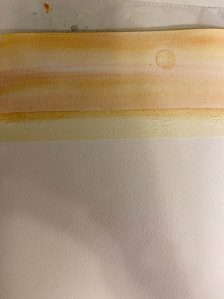
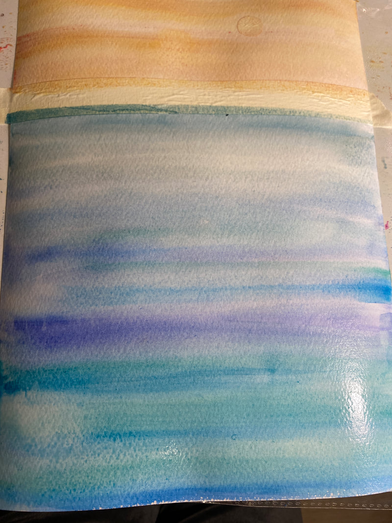
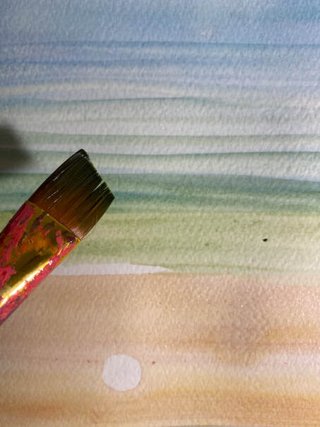 Then create the gradient using the wet on wet technique. Before the paint dries, express the texture of the wavy part with a flat brush.
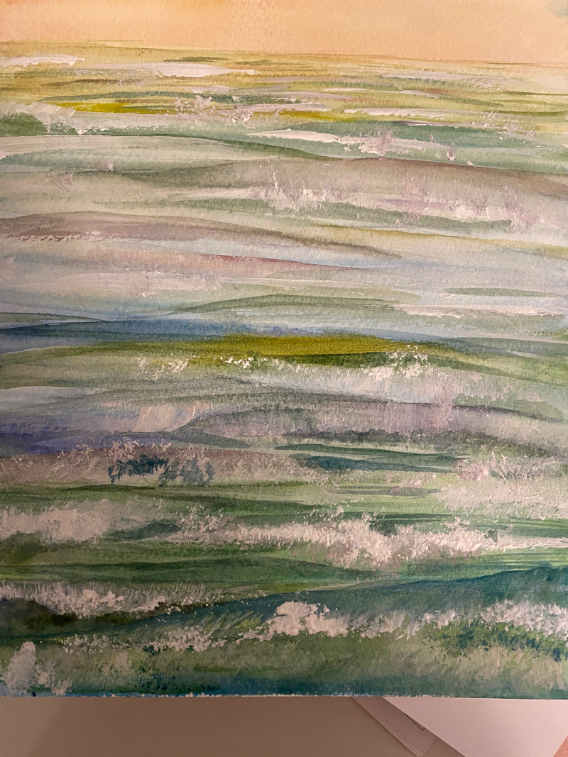
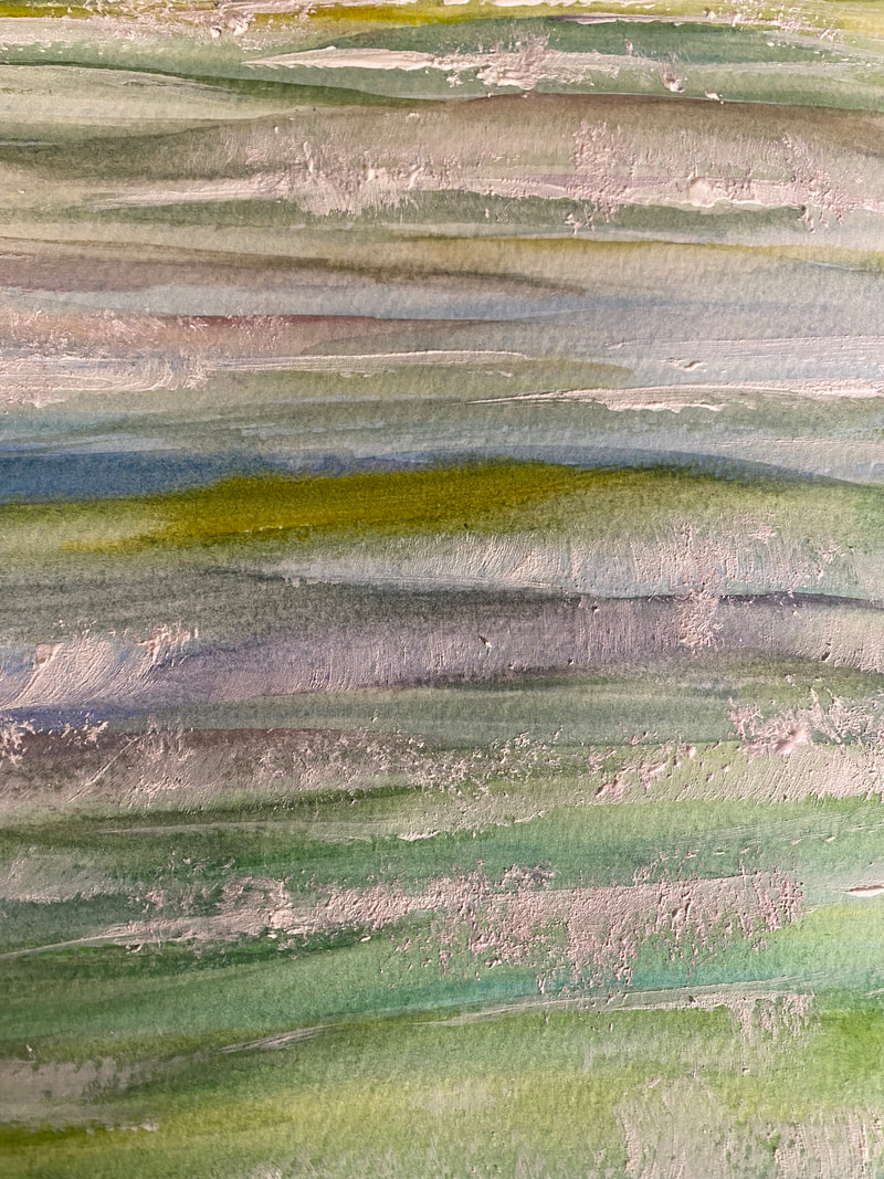
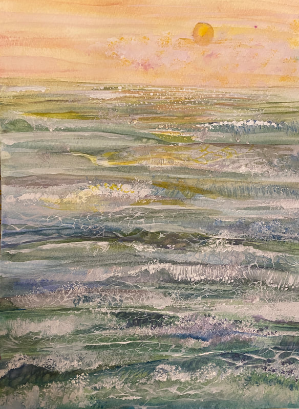
Then, I use the ground white of watercolor paint to express waves, small water droplets, and marble. Below is the finished look. 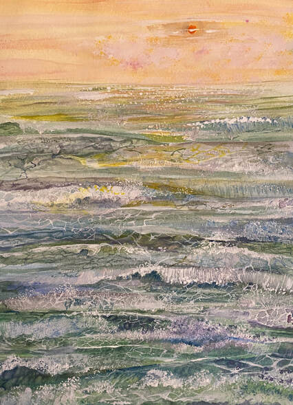 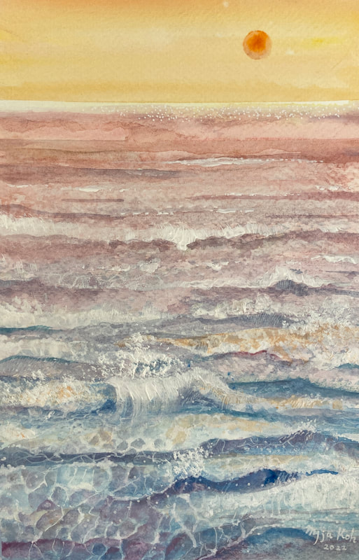  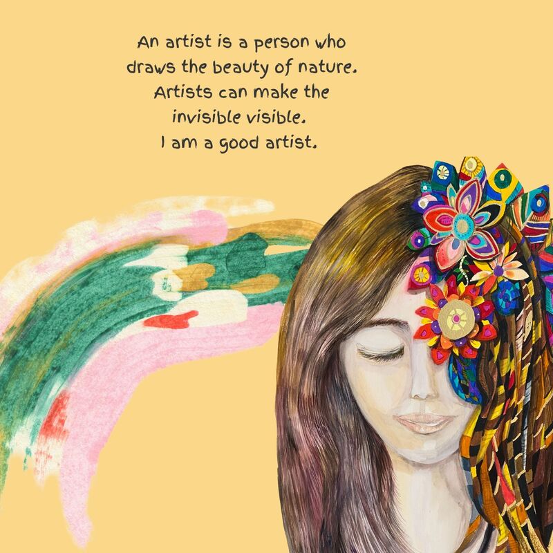 
0 Comments
Finding beauty in everyday life! If you look at the dictionary meaning of "beauty", it is a characteristic of an object that gives sensual pleasure, and it is said that it is a state of harmony that attracts the heart. Although it is difficult to uniquely define beauty, it has a variety of meanings and interpretations ranging from a simple impression of nature and objects sensibly to an emotional feeling for a work of art or an evaluation of the ethical value of human behavior. Above all, finding and enjoying this beauty in the trivial daily life is essential to achieving happiness. Happiness can be said to be the result of long-term influences from various factors, such as genetic factors, human relationships, and religion. On the other hand, pleasure is a simple and instinctive reaction felt in a very short moment lasting from 30 seconds to an hour or two. It's hard to find reasons for happiness, but things that make you happy are easy to spot.  Finding a happiness the little things in life means that we have to focus our attention on what nurtures and sustains us in life. On everything that brings us even the smallest amount of pleasure. It also means practicing gratitude by noticing these everyday things that we take for granted so easily.  Then, what is the little happiness in everyday life for me? It's always drawing.
Sometimes it is difficult to have time to draw, and there are fears that I will not be able to make a living through painting, but when it comes to painting, I am the happiest than anyone else. About changing majors. Statistics show that in the US, 76% of students change majors at least once. 50% change majors twice. There are quite a few students around who want to change their careers because they think that they are not the major they dreamed of and expected even after passing through the huge competition and entering the university. There are many reasons to change your major, but it is basically because the following the reasons work together. (1) I do not like my current major. (2) The major you want to go to seems good. (3) There was a major I wanted to go to, even though I was forced into it because of the competition rate at the university or the recommendation of a parent. (4) The major I chose was not the best option, but the next best option. First, keep in mind that changing majors is a very expensive option that requires reinvesting several years of your time. Therefore, since the cost is large, you should be very careful in choosing to change your major. Especially when you dream of changing into a major that has nothing to do with it. So was my case. I majored in nursing in college and worked as a nurse. Afterwards, I received a master's degree in medical informatics and worked as a researcher before moving to Germany. However, there was a turning point in my life in Germany. I made my debut as a painter, and no matter how much I thought about it, I was convinced that this was my path like fate. And for 10 years without thinking about anything, I only drew pictures, thinking about what painting really meant to me. After much deliberation, I decided to study again. Of course, this is a completely different major than the previous major. In my experience, it is not easy to ignore undergraduate majors. This is the very foundation of life, and it will follow you for the rest of your life. I am often given time to explain my major or field of expertise in the life of a person whose decision at that time was due to the illusion of my moment. I also hope that my undergraduate major and my current direction are somehow related. Even if there is no objective relevance, it is true that because I learned nursing, my understanding of human beings and life is deepened and it helps me to draw pictures. However, this is an emotional aspect and a result that cannot be calculated with a visible indicator. But that doesn't mean you can't change your major to a completely unrelated major. It's a really cool challenge. And there should be no prejudice that the two paths are not related at all and only run parallel to each other just because they go on a different path that does not match the path they have taken. Just by looking at the well-known anecdote of Steve Jobs, we can answer the question of learning something completely unrelated to one's major. Calligraphy was the class that Jobs enjoyed during his school days. He said he liked the design of the letters of the alphabet in various ways. Jobs loved computers, but he also loved those humanities elements. That's why he pursued Bob Dylan's music and hippie ideas. However, most people just separate the two. Computers are computers, and humanities are humanities. Just like an office worker separates his private hobbies from his public work. However, the peculiarity of Jobs is that he tried to incorporate the visible parts of his life that had nothing to do with computers at first glance. Therefore, various fonts using vector graphics were applied to the Macintosh operating system. These fonts made with direction values, not made with dots, look natural even when enlarged or reduced. So Macintosh users could enrich their lives with beautiful, cool fonts. This technology also changed the printing industry. PostScript technology that can print text and pictures on a computer screen as it is with a laser printer was developed. Since then, the Macintosh has created and led the electronic desktop printing (DTP) market. Almost all books today are predesigned on a computer and sampled on a printer. What if Steve Jobs had decided that he didn't need to take calligraphy classes because he was a computer student? Just by looking at this example, you can see that it is more helpful to learn something that is based on one's own attraction, one's own philosophy. They may not be of any help right now, but these things pile up and build up to create my own knowledge.  Another thing is that, in the end, whether it is a previous major or a new major, the fact that one can become an expert by enduring the learning process with a lot of patience does not change. In other words, you must have confidence in your own path and walk firmly on that path without being swayed by any temptation.
Special effects in watercolor It is easy to imagine watercolor paints only in liquid or solid form in tubes and pans. There are pencil-type and crayon-type shapes here. However, when painting, painters often think a lot about how to maximize the beauty of an object. Therefore, with the attitude of learning every day, they try to find and research new techniques and develop them themselves. Today, I would like to introduce powder-type watercolor paint for a moment. Below is an example when powder is used. 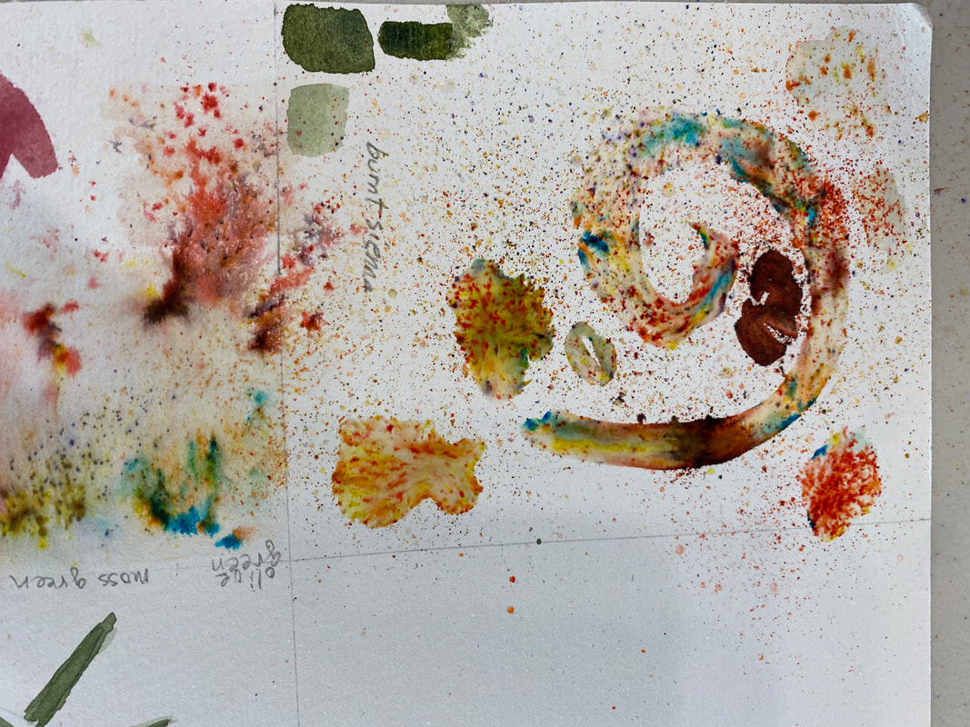 The artist who introduced me to this paint is a painter named Irene. As shown below, wet the paper with a brush or spray and then spray it on top. 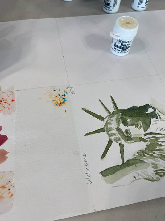 Just sprinkle lightly on the wet areas as shown below, as if you were sprinkling pepper powder. 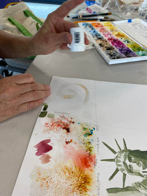 The below is the related color and matched the name : olive green, rose green, sand stone, burnt sienna, sun burst lemon. 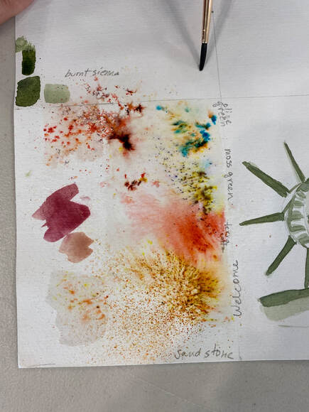 Irene Giannotti, a watercolor artist, applied this powder to the vase in the painting she is currently drawing. 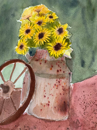 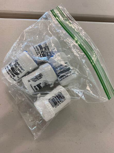 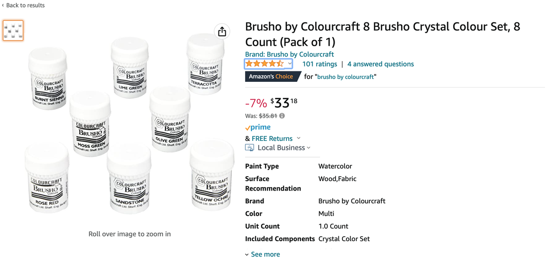 Just as academic scholars exchange information on their research fields and hold seminars or workshops to present their research, artists gather to introduce their learned techniques, show their work, and share new skills. . I would like to thank artist Irene, the painter, for letting me know about the effect through powder today. 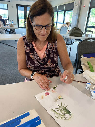 Overcoming the limitations of cheap watercolor paints The U.S. CPI rose more than 7%. It is also predicted from the beginning of the year that high prices will not be easily captured. In this era of high prices and high oil prices, when concerns about inflation are growing, people who paint are more concerned about painting materials than anything else. Especially, watercolors are more expensive than acrylics or oils because they contain a higher concentration of pigment and often require more processing. The little tubes of watercolor paint last longer, thus balancing the high price. If you use oils or acrylics, I’m sure you’ll notice that watercolor paint seems much more expensive. It’s not your imagination. Watercolor paint is much more expensive per milliliter than either oils or acrylics. Below is an illustration that’s based upon pricing that I found online.  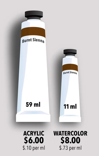 https://drawandpaintforfun.com/why-watercolor-paint-is-expensive/ Purchasing such expensive watercolor paints can add to the economic burden in an era of inflation. So how about a $1 water color as a new alternative? Best advantage is that watercolor painting does not need any fancy equipment. You just prepare all that is required are your paints, paper, and brushes. Watercolor paints come in pans and tubes. Using watercolor pans is easy, as you can begin painting straight away. When it comes to the watercolor tubes, the paint is a bit more saturated and works great for large areas and washes. Also, if the acrylic paint dries, you can simply add a little water to use it again. The $1 watercolor paints I've chosen as an experimental alternative this year are below. This is a product sold by the epoartist company. 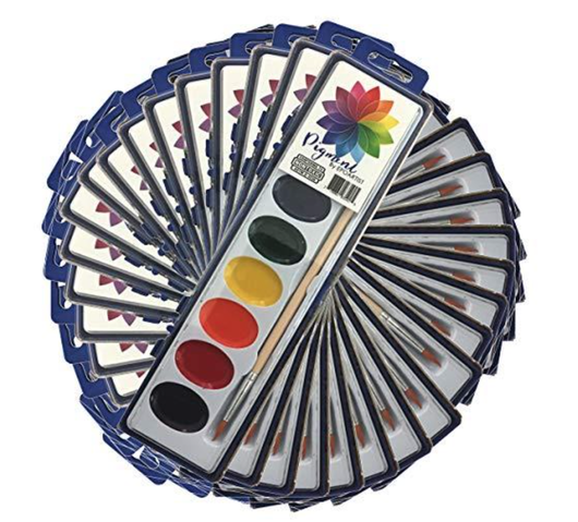
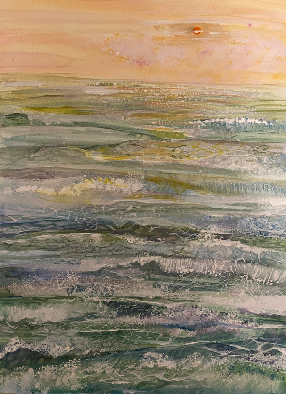
Can a $1 watercolor paint have the same saturation, color, contrast, and blurring levels as expensive watercolor paints? It was the first question mark I had on my own this year. Below is a rose painted with one dollar watercolor paints. Of the roses below, only one rose was painted under the brand Daniel Smith. Can you choose which rose it is? 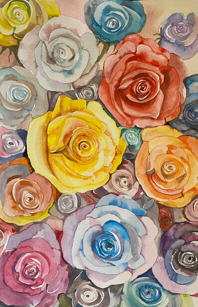 The correct answer is a red rose. 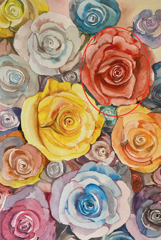 Below are pictures that I got a hint from while drawing that a $1 watercolor can be a good alternative.  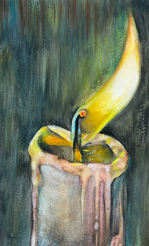 Lightfastness is the ability of a paint to handle sunlight over time and retain its color. You have various measurements of lightfastness, which can either be excellent, good, or poor. Watercolors are not as good with lightfastness as acrylics and over time, if exposed to sunlight and not protected properly, the paint will begin to fade. Not only that, but the paper can also become brittle. (*) In other words, the degree of color change over time was my biggest concern when I opted for the $1 watercolor paint. This is because good watercolors are likely to use high-quality pigments. However, after painting the above candle, my curiosity was resolved to some extent. This is because they found that the level of pigment had no significant effect as long as the energy was well captured by the object. And the beach series below was also a good experiment. Most of the time, white paint isn't something you use to lighten your watercolors. Adding white to the watercolor makes the shape blurry and more opaque. If you want to create this effect, like highlights or other effects, you can use white paint. But other than that, if you want to brighten your watercolor, the only way is to dilute it with water. However, if you try the $1 watercolor paints, you will find that the pigment concentration is significantly lower compared to expensive paints, making it difficult to adjust the saturation. Therefore, when using $1 watercolor paint, it feels difficult to brighten it by diluting it with water. Tiny grains and debris visible in the pigment also have to walk a tightrope, which can be seen as low quality with $1 watercolors. In this case, a good alternative was a white color for the ground of watercolor paint. By using this white color together, we overcome the difference. The picture I used for this experiment is the wave series below. And one of the things I was concerned about using the $1 watercolor paint was the texture. The more high-quality paint, the faster it spreads on the paper, and when dry paint is applied on the paper, the texture can be expressed in various techniques. However, inexpensive watercolor paints have limitations in doing this. In other words, rather than relying on the texture of the paint itself, an external material should be used to cover the poor texture. In this case, it was crumpled paper that was used. After crumpling the paper by hand, I applied paint as if painting a stamp to express a new texture. The mountain series below was born in this way.  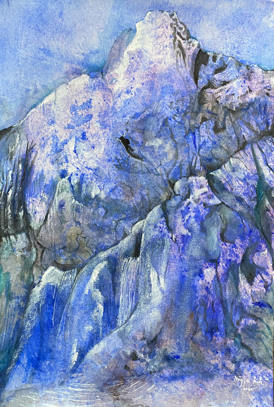 If so, can materials like cotton candy or clouds be expressed with watercolor paint for $1? If done wrong, it may look like a scene from a cartoon. So, the alternative I found was thin paper in the gift box. I crumpled this thin paper and applied it to the paper instead of a brush to express the clouds. Using a third material in this way seems to be able to overcome the limitations of poor materials and expressive power of low-cost paints. 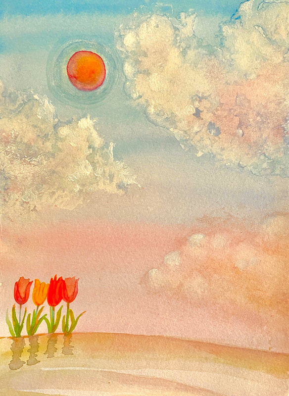   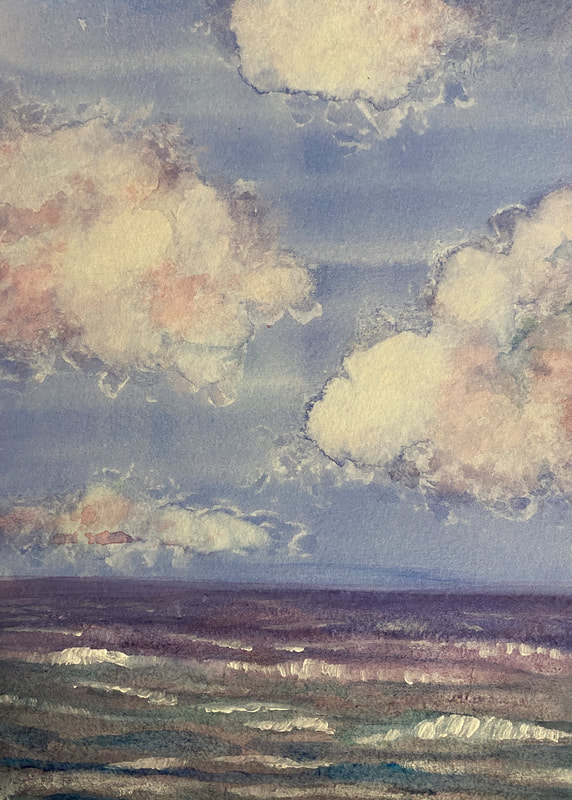  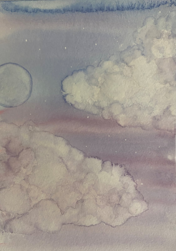  And recently, I completed a new painting by printing watercolor paints with a dry brush without water on an acrylic brush.   These various experiments will allow you to overcome the limitations of $1 watercolor paint. I hope to know many of these cases. Reference: * https://artincontext.org/watercolor-vs-acrylic/
|
Myungja Anna KohArtist Categories
All
Archives
July 2024
|

|
Tutorial |
 RSS Feed