Data visualization by R programming Occasionally I imagine what if it would be like to come to a world without art. Once all the colors of the world will disappear. Even when I wake up and look at the sky, the whole world looks achromatic. I can't feel the brilliant colors of autumn like oranges, reds, and yellows. The image of the season given by color was also dismissed. Decorations and patterns were commonly seen when wearing clothes or eating meals might go out of sight. Living in a world, people will gradually feel it. In what ways can do emotions fade away as a vapor? Even though I only imagined that beauty would vanish for a while, it was just dull and frustrating. There is a real-world where art doesn't seem to work. It is a world of data made up of numbers, symbols, and letters. Data is measured by what is useful and what it means, not by how beautiful it is or evokes emotions. According to the development of the Internet and related new technologies, a lot of data is accumulated on the web. Data Analysis technology using such big data is also continuously updated. There is fierce competition within it. In particular, the stock data has not only an invisible flow but is also valuable for analysis as it is essential data closely related to the market. These data were previously only understood, analyzed, and handled by relevant experts. It was the same situation just as in the Middle Ages, some monks, clergy could read and interpret Bibles in Latin and made them available. However, the world is changing rapidly, and now the time has come for the public to look at open data, analyze it, predict a graph, and come up with a prescription. Various analysis contents are overflowing just by looking at related YouTube. In the first paragraph, I tried to draw a world without art. What role can art play in a world of data overflowing with numbers and formulas? However, even data whose color, shape, and composition do not seem important evokes various emotions when the data is expressed in a graph, and the meaning is given. Stock data does. When we look at charts that go up or down, we get mixed up. Sometimes investors cry and laugh at the green-red color. Whether the graph soars up like a mountain or moves flat, everyone pays attention to its shape. 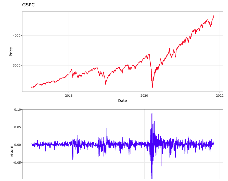 Sample graphs, Girin instruments Artists can play the role of visually and more usefully showing data analyzed based on these scientific and mathematical grounds. Artists select colors more sensitively than anyone else and explore the meaning of shapes and compositions. They know the power of color. I am well aware that every time the saturation and brightness of each color change, it can evoke certain emotions and even expand into the spiritual realm, touching people's hearts, making them feel moved and energized. So I hope that artists can participate as a coworker in the data analysis a lot. It would be great if you could deliver comfort, energy, and sometimes even a little bit of alertness to the stock data, which is fraught with so many risks. I am currently studying R Programming, R Studio, a program that statistically analyzes stock data to visualize stock data. In the future, related contents will be posted on this blog sequentially.
0 Comments
Leave a Reply. |
Myungja Anna KohArtist Categories
All
Archives
July 2024
|

|
Blog for visual thinkers and artists ... |
 RSS Feed