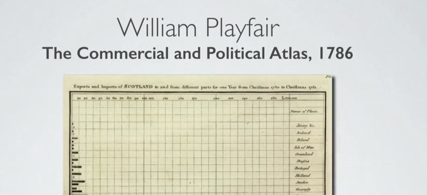
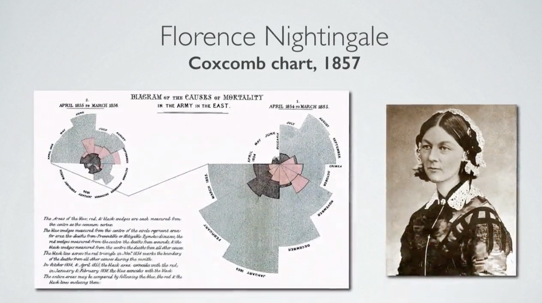
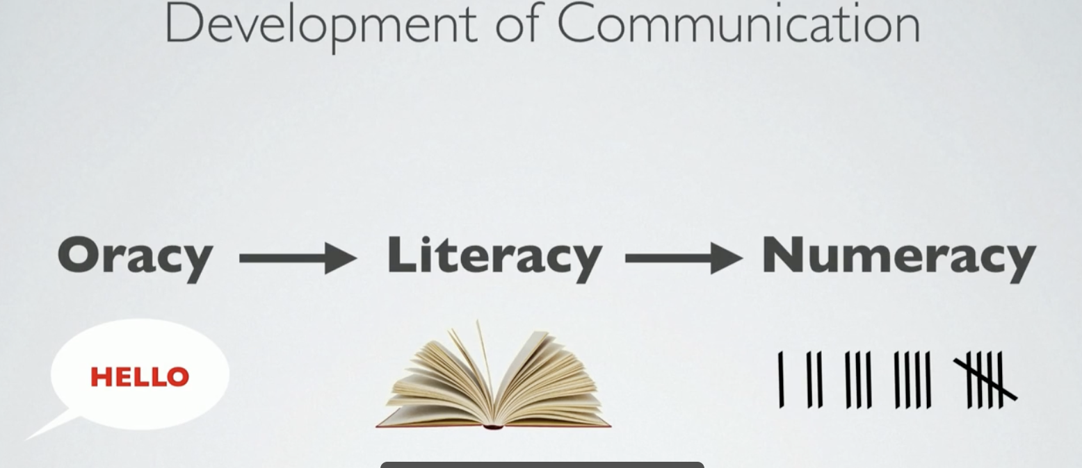
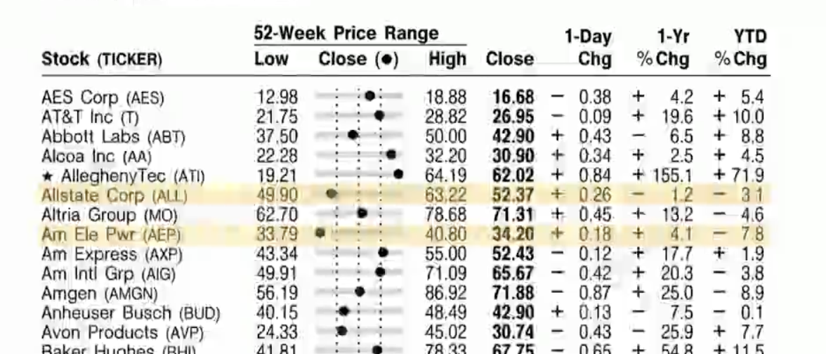
Overview of good infographicsInfographics are a visualization of information, and the vocabulary itself is a compound word of information and graphics, which represents information. Also called news graphics. William Playfair (22 September 1759 – 11 February 1823) was a Scottish engineer, political economist, and advocate of graphical statistical analysis. Key figures in politics and business do not have the energy to pay attention to trivial details. We hope these diagrams will save you the trouble of checking annoying and tiring details and help convey information clearly.” Playfair knew that well-organized graphs would save time and effort. Nightingale used the data to create a graph that combined an overlapping bar graph and a circle graph. It is also called a rose graph because its shape resembles a rose. The blue area represents deaths from infectious diseases, the red section represents battle deaths, and the black section represents deaths from other causes. At a glance, we can see that the proportion of epidemic deaths is much higher. Infographics have a strong tendency to convey information through stories. While big data is used in the domain of experts, infographics are suitable for conveying specific information and messages to the general public. Humans have relied on vision to collect and understand information since before language and writing. I was very impressed by Tommy McCall's TED talk where he expressed stock data as a visual infographic using a single dot. It shows that complex charts and formats are not important in simplifying complex data into a visually easy to understand form.
0 Comments
Leave a Reply. |
Myungja Anna KohArtist Categories
All
Archives
July 2024
|
Proudly powered by Weebly


 RSS Feed